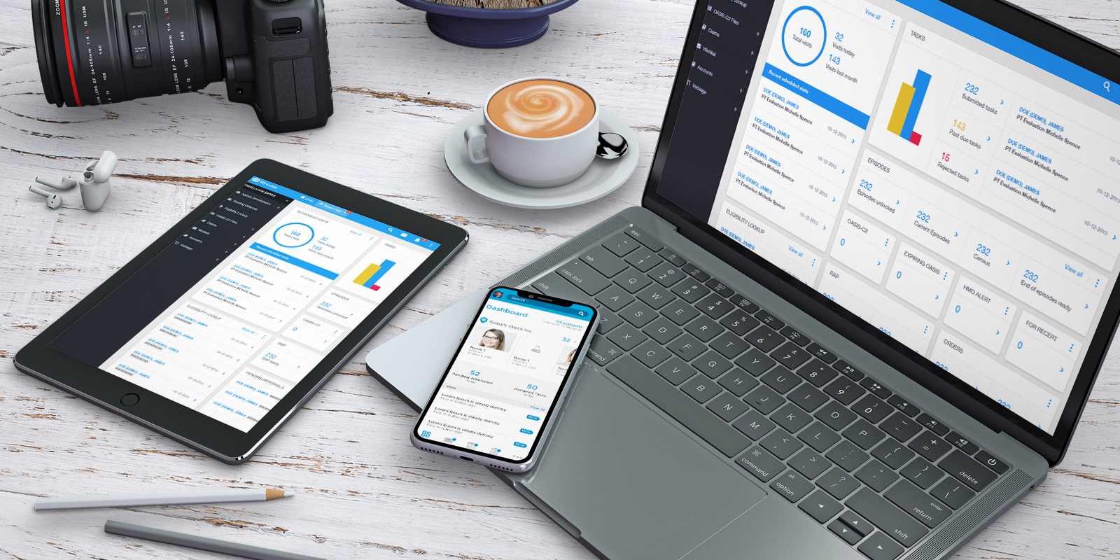
This app is intended to be used by home health care agencies to help them automate and streamline their day-to-day tasks. With point-of-care system also integrated, and includes financial reporting, revenue cycle management, and business analytic.

Problems captured from the existing web app
1. Design and layout is outdated
2. Too much boxes making it look cluttered
3. Some key navigation items are hard to find
4. Structure needs an overhaul
5. Ease of use and intuitiveness is neglected
UX analysis
The client provided me with a lot of data that are useful for
me to start conceptualizing on the redesign of their existing app. Data
includes how many users finds it difficult to navigate through the app, how
many users demands for an overhaul, how many users have failed to accomplish
something simply because it is not too intuitive, etc.

The solution I figured of course is to redesign the old flow
and layout, adopt the same colors but add new colors that are within it’s
scheme. Work on a mobile app design that has the same dashboard as the web app
but displays only key items and can be expanded to view more. A complete
overhaul it may seem.

Creating a sitemap via card sorting
I managed to create a sitemap by conducting a card sorting
session with the client and the dev. We are able to sort what are the key
functionalities that needs attention and which functionalities that we can drop
or not give much emphasis.

Learning
In this session I learned that having continuous
collaboration with your client and forcing them to be collaborative will
definitely help fast track the process. At this point we all have agreed on a
structure and flow has been created seamlessly.

With the use of adobe XD I started to create low fidelity
wireframes for both web app and mobile app, created a prototype and presented
it to the client and dev. After approval the client who is based overseas
conducted a user test using guerrilla approach. He sends me the outcome and I
studied it and made necessary changes to the wireframes. Also at this stage the
dev already starts creating templates as well.
Learning
In this session I learned that test data are very important and should be used as basis for changes and iterations as it reflects actual people's needs.

First I create initial mockups for them to choose from. Once
approved I start buidling the rest of the pages. And hand over to the dev for
coding. I also assist the dev by creating a styleguide, and I also provide
guidance while he turns the designs into live working element.
At this stage also the client decides to park the mobile app
version as he lacks budget for it to push through ( FYI having a mobile app is
my suggestion ;) ).
For me redesigning a site is basically almost the same as creating it from scratch. So moving forward when designing I must be able to come up with a long term solution and a design that will last for more than a decade or so or a lifetime perhaps :D Hopefully integration of future functionalities will then be a breeze. Overall I think the project is a success as after the first release a lot of good feedback from it’s existing users have been made and the client is Happy as well even with the setback of not being able to push through with the mobile app version.
I am proud to say that this app is a success because of the following measures
(based on Usabaility Testing)